Usability 101: Wasting the customer’s time
I’ll begin this series on usability mistakes with a perfect example of “how to waste your customer’s time and turn them away.”
DADAmobile is a web service for downloading games, ringtones and other content to your mobile phone. I was trying to download a game for my Treo 650 mobile phone when I encountered the following:
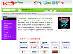
The first screen looks promising. It gives a description of the game you’re about to download and offers an informative selection of mobile phone brands. Just click on your particular brand of cellphone and off you go…

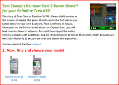
I clicked on Palm and was now given the choice to choose between Palm models, the Treo 600 or the Treo 650, complete with pictures of both models. So far so good.

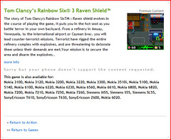
Selecting my mobile model (Treo 650), I thought I’d be shown download instructions (or, worst case, subscription instructions). Instead, I got the following screen, telling me that “Sorry but your phone doesn’t support the content requested.” (sic)

Now, if they’re smart enough to tell me now that my phone won’t run the game I selected, they should be smart enough to tell me so before I waste my time on their website.
In this particular case, the software logic is already there. It’s not like they need to hire a programmer and rework their website. They simply need to move the code that checks for phone compatibility a few steps before its current location.
Lesson:
Check the flow of your website and make sure you optimize the places where you branch out or exit. In the above example, not only would DADAmobile save their customers time and aggravation, they would also save bandwidth by not serving two additional pages.
technorati tags:usability