Seriously, who runs Microsoft’s Usability Lab?
Check out the Preferences Pane for the four Microsoft Office applications (Word, Excel, PowerPoint and Entourage). They all look different and behave differently.
Shouldn’t programs in the same office suite at least look alike?
While setting up the latest Microsoft Office suite on a friend’s Mac, I needed to set all applications to save to Office’s previous file format by default – for better compatibility with clients who might not have upgraded to Redmond’s latest.
Check out these images of the Preferences pane for each Office app and where the file format compatibility settings are stored:
Microsoft Word:
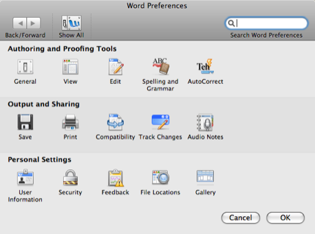
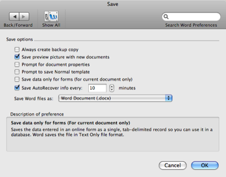
In Microsoft Word, the Preferences Pane looks a lot like Apple’s System Preferences Pane and you select the default format you want to save files to on the “Save” tab under the “Output and Sharing” section. Looking good so far.
The Microsoft Word Preferences Pane
Microsoft Word Preferences : Output and Sharing : Save Pane
Microsoft Excel:
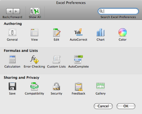
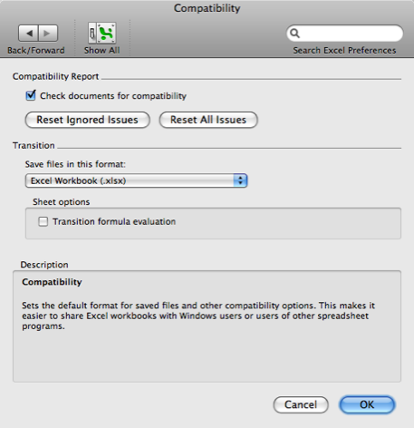
Excel’s Preferences Pane also look a lot like Apple’s System Preferences, but now the “Save” tab rests within the “Sharing and Privacy” section. Worst of all, you select the default format you want to save files to on the “Compatibility” tab. Word also has a “Compatibility” tab, but it does different stuff.
The Microsoft Excel Preferences Pane
Microsoft Excel Preferences : Sharing and Privacy : Compatibility Pane
Microsoft PowerPoint:
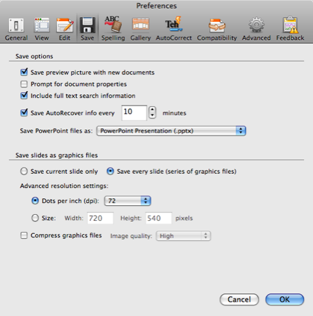
Powerpoint has a completely different Preferences Pane, with all tabs displayed at the top like a toolbar. It also has a “Compatibility” tab, but you select the default file save format on the “Save” tab.
Microsoft PowerPoint Preferences : Save Pane
Microsoft Entourage:
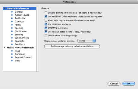
Entourage is so different from the rest of the Office suite that it doesn’t surprise me to see a totally different Preferences Pane. There’s no need to set compatibility options here, but take a look at it anyway.
The Microsoft Entourage Preferences Pane
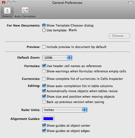
For comparison, here’s Apple’s iWork (Pages, Numbers, Keynote):
The Apple Pages Preferences Pane

The Apple Numbers Preferences Pane:
The Apple Keynote Preferences Pane
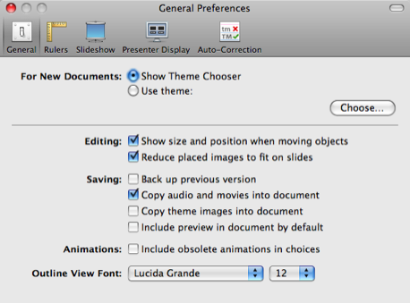
They could still look better, and more like Apple’s OSX System Preferences Pane, but at least they all look alike.
I wonder if they’re this lazy and incompetent with Office for windows? Thank god for Apple’s iWork, if only to give MS some competition to their Office suite. Maybe it’ll push them to make a better product next time.
I don't really know what gotten into windows office mind and they copied the concept of apple.. they were too damn lazy to create their own layouts..
It's almost the same with Apple. I hope Windows would have their own layout for uniqueness is important.